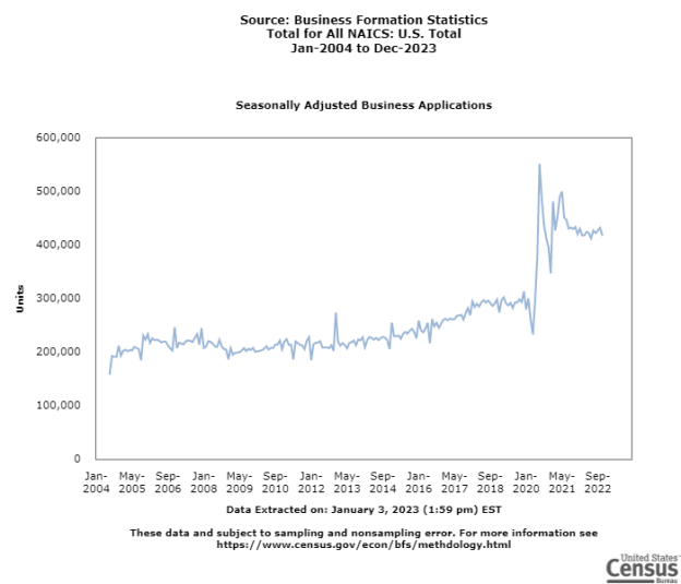
Back in October 2020, I wrote a post about the jump in new business applications. Despite some initial volatility, the increased number of business formations has continued. I guess this is part of our new normal post-Covid.
These data show a jump back in 2020 and a leveling of new business formations at a higher level than in the years from 2004 to 2020.
You can make your own charts with this data using the link here: US Census Data Tool
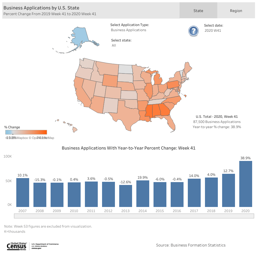
According to recent data from the US Census, business applications are up almost 40% from last year, with most of that happening in the third quarter of 2020. The charts below show percent changes for week 41 (out of 52) for 2020 and 2019. For week 41, there are 38.9% more applications this year than in 2019. For comparison, the applications in 2019 were 12.7% higher than 2018, which was only 4.0% higher than 2017.
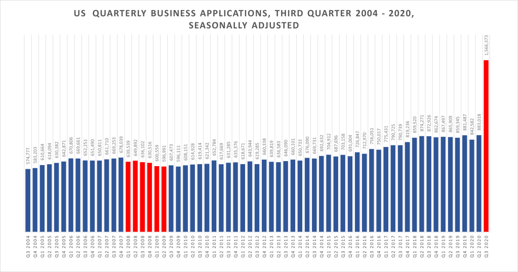
The chart below shows a skyrocketing increase in applications in the third quarter of 2020. We didn’t see these kinds of increases during the great recession (in red). So, why do we see this now? What is different this time around? I’m wondering if people are re-starting old businesses. Even so, I would have expected to see a dip in the second quarter, but there isn’t one.
Source: QuantGal created chart using data downloaded from US Census, Business Formation Statistics, 2020 Q3
Last time, there were financial factors creating the crash. This time, it’s much more intense, with entire sectors of the economy shutting down for months. World travel came to a near stand still. This is global and is greatly impacting supply chains for manufacturing and retails sectors. This is a horse of a different color. We are still having to wait and see what happens as we head into cold and flu season. Our physical health is at risk. Our financial and economic health is at risk. We are also heading into the retail sectors favorite time of year. But this year will be different – less travel, less shopping, less events and parties.
We still don’t know if we will see another wave of shut downs and hospital crises. We are still playing wait and see.
[ Note: You can learn how to create your own bar charts using FRED data with this pdf.]
Algebra 2 is a required course for University of California freshman applicants. Is it also a prep course for a career? It sure could be!!
I would love to never hear again, “When am I going to use this?” Or, at least, I want them to be able to answer that question themselves.
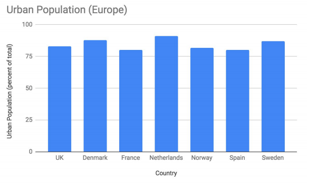
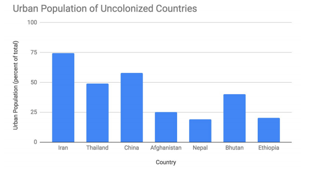
Source: Student Project by Audrey F.
Personally, I really liked math and statistics and ended up getting my master’s in economics, specializing in econometrics. But, it wasn’t until grad school that I finally put all those early years of math to use. It was so cool to be doing applied math. If you like math and enjoy the ‘struggle’ of figuring things out, the traditional approach to learning Algebra 2 might be just fine for you. However, I will say, that once there was a real problem to solve with math, the math was even more exciting for me than it was before. Previously, I hadn’t made a connection to a real purpose for studying it, I just enjoyed doing and learning math for maths’ sake. But not everyone feels the same way. As a teacher, I really want students to be excited about what they are learning.
Source: Student Project by Audrey F.
When I’ve taught my statistics students to download data and work with it for a presentation and let them choose their topics, I’ve been amazed to see students who had not been very engaged previously, become excited and start proactively asking about where to go next with their ideas. They took a real ownership of their learning. As a teacher, my job got really easy, too. Classroom management was not an issue and grading was easy because I knew where the students were. Most of my time was spent troubleshooting and circulating and talking to students about their projects. Students had a detailed rubric (but at the same time vague enough to allow for personalized outcomes) which we used as a talking tool to keep them moving towards covering all of the elements necessary for a high grade. I feel these projects prepare students for career and for college courses that require data analysis.
The images in this post are examples of a student, Audrey F., choosing to look at urban populations in different countries. Her rationale for which countries she chose for comparison are explained in her project. She describes what she found and then tries to find reasons for the differences in these groups. Some students need help narrowing down topics and they all need time to think critically. However, as more of this applied math is used, it gets easier for students and teachers.
Once I was working with data and looking for patterns and trying to put mathematical models to social, financial, health, and economic data, I was finally putting to use all that math I had learned in Algebra 2, Pre-calculus and Calculus. However, that was years after taking those courses. I wished I hadn’t had to wait so long to make those connections.
When I was learning, we didn’t have computers, iPads, Chromebooks, phones and easy to manipulate programs like Google Sheets or Excel or the free data analysis language R. So, it was easier to accept the traditional ‘pen and paper, no calculator’ approach. Plus, not everyone was taking those high level math classes. I think college pressures were lower and high school graduation requirements were just for Algebra 1 completion.
Now that data analysis tools are widely available, I really think we should be changing how we teach log functions, quadratics and other super cool math concepts. Teaching from a data science lens allows student to pick topics they’re interested in, create data displays, research the history of other countries or trends and create presentations that they can add to portfolio of work for when they move on to other courses or college and career.
Of course, that’s easy for me to say. I learned these applications and can easily share them with students. What about math teachers who haven’t had this exposure, though? There is a push right now from some pretty powerful minds – Jo Boaler and others – to get data science into the California math framework and it’s becoming more a part of standardized exams. I see it as a way to get students performing at high levels of analytic capacity on topics that matter to them. I see it as a way to integrate the curriculum with history, English, social science, science, technology and even art. I feel the disengaged student would become engaged – their strengths may show in ways that they didn’t even know they had under a traditional approach to teaching high level math.
Am I advocating that the entire course be project-based and applied? No, certainly not. However, some attention to application through data science would really help in terms of increasing engagement for all students, especially those who may not being served by our regular program, and in providing students some skills that are very much in demand today.
But, again, how to we get this professional training into the hands of our already hard-working, over stretched excellent teachers? I would love to come and do a workshop your teachers! Reach out via email at laurie@quantgal.com.
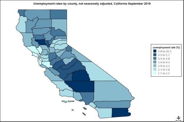
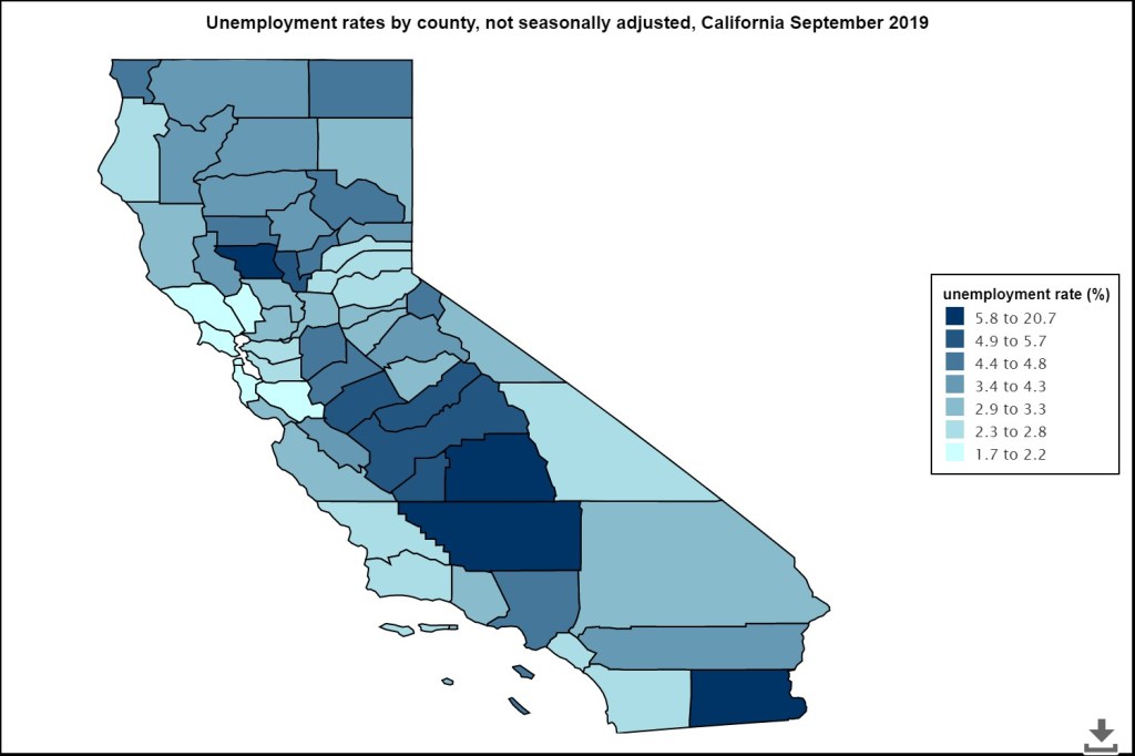
When we hear that the unemployment rate is low and the economy is doing well, that’s not necessarily true in regional markets. The current 3.7% unemployment rate doesn’t really tell you what’s happening on the ground for many people and job markets. That’s a national average statistic. However, in some areas of California the rate is less that 2% and in other places it’s well above 6%. In Imperial County, it’s about 21%.
The above chart shows you the rates by county as of September 2019 in California. Most of the dark blue regions are between 5.8% and 7.6% percent. The only county higher than that is Imperial County at 20.7%. The next highest Rate is in the Central Valley county of Tulare, at 7.6%.
The lowest rates are in the San Francisco Bay Area, with San Mateo County at 1.7%, San Francisco at 1.8% and Marin at 1.9%. That’s one reason it’s hard to get people to work at low paying jobs in this area. Housing costs are extremely high, with wages that don’t support those high costs for many professionals.
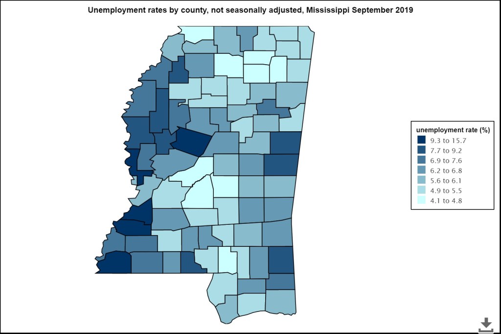
If you look at a state like Mississippi, you see a different range of unemployment rates by County. The lowest unemployment rate in Mississippi is Rankin County at 4.1%, above the national average. The highest county unemployment rate is in Jefferson County, at 15.7%.
These unemployment rates are directly related to home costs. The more unemployment, the lower the housing prices. In low unemployment rates in some counties can drive up home prices, which push out lower income people and can make it hard to find employees for certain jobs, like teachers. Teachers work long hours and don’t want to add a long commute, especially if they also have a family.
Please feel free to leave a comment using the link at the top of the post, especially if you have some personal experience with these issues.