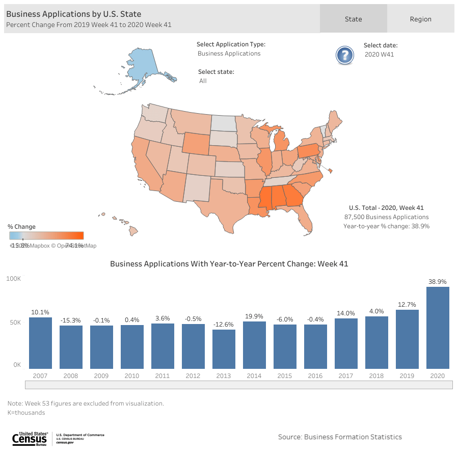
According to recent data from the US Census, business applications are up almost 40% from last year, with most of that happening in the third quarter of 2020. The charts below show percent changes for week 41 (out of 52) for 2020 and 2019. For week 41, there are 38.9% more applications this year than in 2019. For comparison, the applications in 2019 were 12.7% higher than 2018, which was only 4.0% higher than 2017.
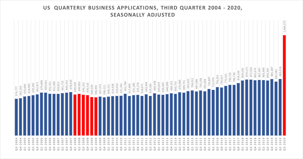
The chart below shows a skyrocketing increase in applications in the third quarter of 2020. We didn’t see these kinds of increases during the great recession (in red). So, why do we see this now? What is different this time around? I’m wondering if people are re-starting old businesses. Even so, I would have expected to see a dip in the second quarter, but there isn’t one.
Source: QuantGal created chart using data downloaded from US Census, Business Formation Statistics, 2020 Q3
Last time, there were financial factors creating the crash. This time, it’s much more intense, with entire sectors of the economy shutting down for months. World travel came to a near stand still. This is global and is greatly impacting supply chains for manufacturing and retails sectors. This is a horse of a different color. We are still having to wait and see what happens as we head into cold and flu season. Our physical health is at risk. Our financial and economic health is at risk. We are also heading into the retail sectors favorite time of year. But this year will be different – less travel, less shopping, less events and parties.
We still don’t know if we will see another wave of shut downs and hospital crises. We are still playing wait and see.
[ Note: You can learn how to create your own bar charts using FRED data with this pdf.]
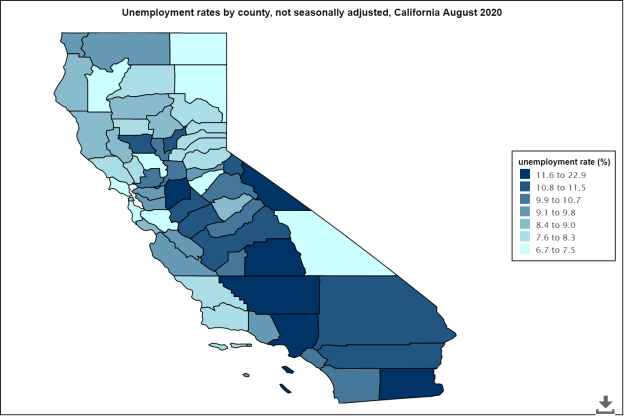
A while back I was playing around with a data mapping tool from the Bureau of Labor Statistics. I thought it would be an interesting idea for something ‘real’ to do with my students. I wrote a post with some examples of maps of California and Mississippi with the intent of showing how much our national unemployment rate at the time (3.7% or something) doesn’t always mean things are rosy everywhere. Here the new map, post Covid-19 for California – the scale has moved from a low of 1.7% in the San Francisco Bay Area and a high of 20.7% in Imperial County to a new range of 6.7% to 22.9%, with many more counties in that top bracket.
Source: QuantGal inquiry using US Census data Mapping Tool
This is a significant shift. These data are from August, five months after the economy shut down across the State. The San Francisco Bay Area maintains some of the lowest unemployment rates, but the number of counties with 10% or higher unemployment rates has moved from 1 to 20 out of 58 counties.
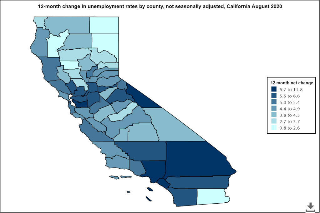
Here is a map of the net change from August 2019, one year prior. The darkest shades of blue represent the counties with the greatest percent increases in unemployment rates from August 2019 to August 2020. So, even those San Francisco Bay Area counties are seeing large percent changes in unemployment rates.
It will be interesting to see what the holiday season brings. Some expect to see less seasonal hiring this year. There’s a report about seasonal summer jobs from June 2020 for young adults from one of my favorite sources for great reporting on the economy, Marketplace. Here’s another great report on what we might see in our recovery period.
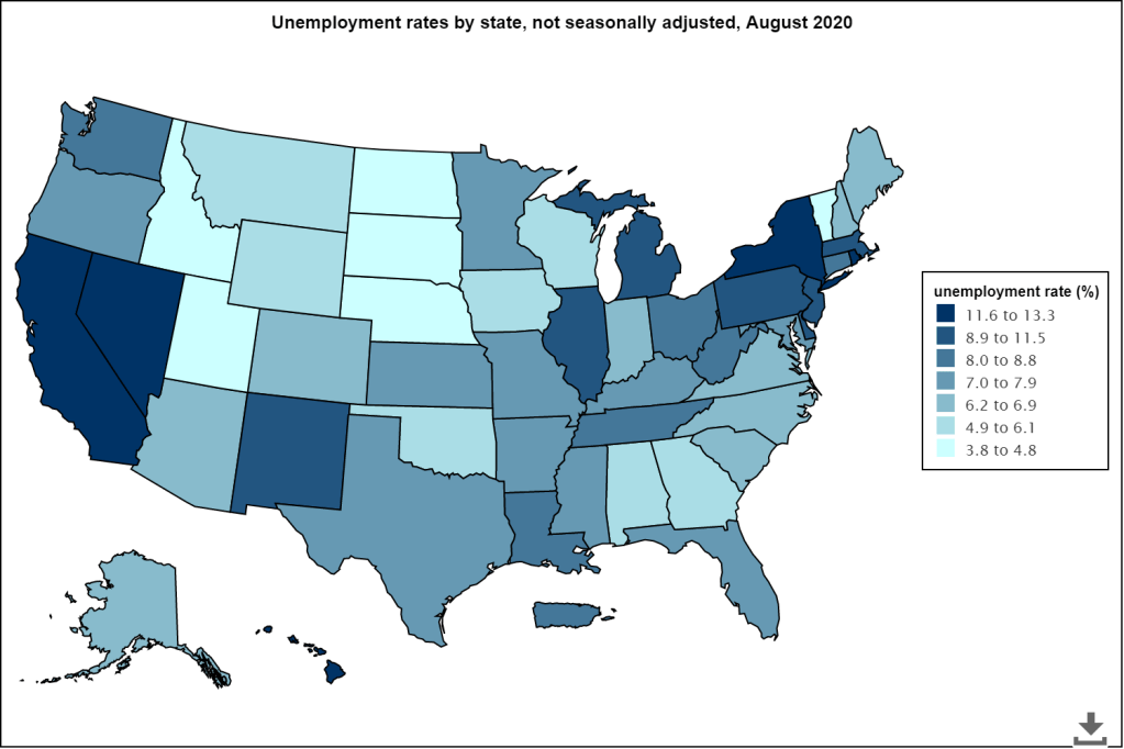
Overall rates are high in the US, particularly in California, Nevada, New York, and Hawaii.
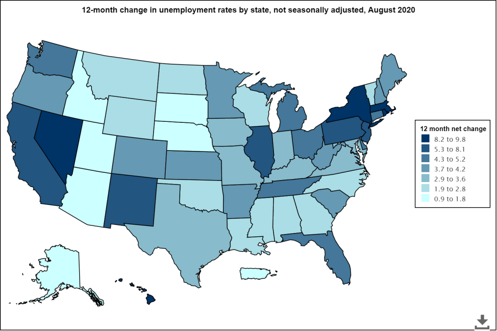
Here’s map of the percent change from August 2019 to August 2020:
While some states are seeing change is the 1-2% range, others are in the 5-10% range. What makes these changes vary? The types of industries and employment in some areas are simply different. Some areas depend more on tourism, like Hawaii, where we see a 9.8% change in unemployment, one of the highest in the nation. ,Nevada Rhode Island, and Massachusetts are also among the highest with increases of 9.4%, 9.3% and 8.4% respectively.
California and New York are amongst the highest with increases of 7.4% and 8.5% landing them at unemployment rates of 11.6% and 12.6% respectively. That’s a big jump from last August when both of those highly populated states saw low unemployment rates of 4.2% (CA) and 4.1% (NY). That’s a lot of people out of work, and doesn’t account for the number of people who may have left the labor force or are currently underemployed.
Nationally, things are better for most states compared to July 2020. The darker, the better. Those blue states are showing a slight increase, with Kentucky going from 4.5% unemployment to 7.6%, the biggest jump nationally.
Let’s keep our fingers crossed that job growth continues to go up and there is reliable vaccine that comes out soon. Here is a link to Marketplace reports on the vaccine dynamics: https://www.marketplace.org/collection/fast-track-vaccines/
In 2013, I wrote my master’s thesis on Algebra 2 as a gatekeeper course. I used performance data from the standardized test at the time, the STAR test. It tested every student every year in mathematics, by the course they took.
Since then, some things have changed including the standards we teach for each course and the frequency at which we test students. We administer a standardized test in high school mathematics only in the 11th grade. There are some others, but this is the main one for monitoring proficiency levels on a wide-scale basis throughout California.
I was wondering if our proficiency scores had improved over time. At a glance, they haven’t. But, let’s dig deeper. In some ways, this is an apple to oranges comparison because now all students take the same exam in their junior year of high school, instead of taking an exam every year, based on which course they are currently taking. The exam is administered mostly online and is apparently interactive. You can get detailed information about how the exam works here. In fact, there is a lot of detail there and it may be overwhelming, so good luck!
I decided that the best approach for comparison would simply be to look at the Algebra 2 proficiency scores and compare them to the 11th grade exam, since it is the recommended path that most students take Algebra 2 by their junior year, even though some take it sooner and some take it later.
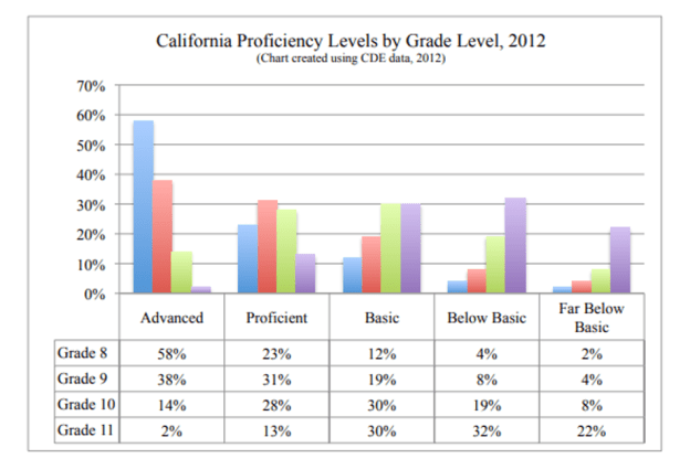
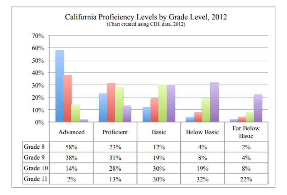
You can see the results for 2012 Algebra 2 proficiency for each of the Counties in the 9-County San Francisco Bay Area and the State of California here. The main graphic that shows the break down of proficiency level by grade for Algebra 2 is below:
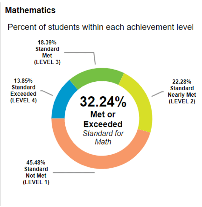
This chart shows proficiency levels by grade for Algebra 2. You can see that the younger students are doing better than the older students. The reasons for this are explored in the thesis. This post is meant to focus on whether or not things have improved since then. The thesis examines breakdowns of proficiency levels by grade (above) and by gender and race and ethnicity levels. For comparison purposes, let’s look at the California dashboard for math proficiency scores for 2017-2018. I would think, with seven years of transition time, an easing of the standards, more emphasis placed on understanding relationships and an interactive test, we will see a strengthening in our proficiency levels. Below are the overall results for proficiency levels for the state for 2018-2019.
Source: California Department of Education Website, 01/20/20.
I don’t know about you, but the 32.24% met or exceeded Standard for Math does not seem very good to me. Back in 2012, many students were taking Algebra 1 in 8th grade – the popular thought at the time was that younger students were doing better, so have all students take algebra in 8th grade. That has since gone by the wayside as many students were not successful in that model. For tenth graders, though, proficiency levels for the state were at 42% (link to report and view pages 22-23 for detailed state and county information).
Unfortunately, with all the implemented changes, there doesn’t seem to be an improvement in outcomes. The reasons are plentiful, but it’s got me questioning our system. We are teaching an antiquated model: Algebra 1, Geometry, Algebra 2 in an attempt to move students to Calculus and be successful. However, I question this goal. In practice, many people working in analytic fields requiring mathematics backgrounds are using computers to solve problems and make calculations. Those computer skills – programming, analysis, and data use, are not making it into the classroom until much later in a student’s education career.
There is a move to make more changes to our system that incorporate some data science which includes analyzing data, learning to write some code, and understanding how to create data displays. I have no idea if this approach would raise proficiency scores, but I don’t really care. I think the testing system is dramatically flawed and we keep trying to get the teaching and testing right around these antiquated approaches to the curriculum pathway.
I believe the core three years of mathematics education should shift from proof and abstract problems to applied problems that prepare students for careers other than mathematicians. Our system builds from generations of candlelight and paper and pencil-based tools. That simply is no longer our reality and we need to make some jumps in our methods and expected outcomes.
We should keep teaching about functions and lines and logarithms and conic sections. It’s just that we should include applications. Applications are abundant. We need people who work in fields that use these functions, programs and relationships to help design effective and interesting problems for students. I know that I can do this in economics, and there are others who can do this with physics, medicine, engineering, etc.
We can teach students some coding using R, but teachers need to learn it, too. There are free resources to help with that! Just google “free resources for learning R.” Wait, I just did and have included a link at the bottom of this post.
The opinions stated above are mine alone – oh wait! They are not mine alone. Please check out Jo Boaler’s YouCubed website if you don’t believe me: https://www.youcubed.org/resource/data-literacy/ Then, Scroll to the bottom and see all of the articles and resources that back up this idea.
My other big concern is how today’s math teachers, who may not have had experience with data analysis, are going to be able to implement changes. I am hoping to help with this.